Knowledge Curation and Design: Gardens, not Stained-Glass Windows

“It’s a garden, not a stained-glass window” is a metaphor I came up with to talk about knowledge management, content management, ongoing curation and database management, and iterative design processes. I think I started using it about ten years ago. A few different people have recently told me how much this concept has helped them, so I’m putting it here on my blog for intellectual property/attribution reasons.[1]

Many ideas in U.S. corporate culture come from industry and manufacturing. Objects and processes in a factory, mine, or construction site have to be perfect in some ways—they have to fit in a specific slot and happen at a specific time, or other things will go badly wrong. This interchangeable parts/assembly line/standardized processes way of thinking has created efficiencies and opportunities for expansion beyond the wildest dreams of the artisanal producer.

But this industrial mindset also (in my opinion) warps our way of thinking about other kinds of work. In my professional milieu (focused mostly on knowledge management and web content strategy), many things can’t ever be perfect, or finished. I used to find this frustrating. I like finishing things: making something polished, and checking it off a list. I used to feel panicked letting something go when I knew it could be better.

We also live in a time when few things are made to last. A stained-glass window in a Gothic cathedral had to be as perfect as possible; it was made to last a thousand years, unchanging. I used to feel the same way about my work—that it would be a permanent reflection of me, or of a moment captured out of time.

Then the metaphor came to me: These are gardens, not stained-glass windows.

This metaphor encapsulates and summarizes a lot of other thinking—from “the perfect is the enemy of the good”; to artistic or aesthetic traditions that acknowledge transience and imperfection (Arachne’s hubris, wabi-sabi, the apocryphal-but-appealing imperfect stitch/Persian flaw/humility square); to Seth Godin’s “Ship!” concept.

Recognizing that you need to constantly change things doesn’t mean you failed in the first place. A garden is never “finished.” You plan, and you plant, and you tend. Dig up weeds, or leave them be. Carry water, or wait for rain. Become the mother of mantises. Some things grow better than you expected (make a bigger bed for them, next year). Sometimes things don’t go well; your soil has an invisible pathogen, and all the cantaloupe plants turn to rot. A tree next door dies, or your neighbor builds a new fence, and the light in your garden changes. You have an early hot spell, and all your lettuce bolts and turns bitter. Maybe the people you are feeding suddenly become allergic to eggplant, or decide they don’t want to see another turnip until next year.

So, a small practical example: You worked hard on that user manual. You took every function into account, organized it in a way that made sense to you, and crafted the instructions carefully. But your work is not done: Watch to see how (or whether!) people use the manual. What challenges can they still not solve themselves? What questions do they still ask? Check your readability; are your sentences too complicated? Do you use words they don’t know? Check your information architecture: Do people not understand your category names or chapter titles? Maybe they don’t want a 300-page reference book at all. Maybe they want a “Top Five Tips” sheet.

Another: You made a website. People used to come to the homepage and click through the navigation to find what they are looking for; more often now they come to a specific page from Google or Facebook. They look at one thing, and they leave. Do you try to force them through the homepage—make them come through the garden gate, walk past the things they don’t want, dig for the things they do? No. You change your page aliasing, check your metadata, submit a sitemap for crawling, make sure your site search works well. Or you push new posts straight to social media. This delivers your goods to the people who want them—sometimes before they are even inside the gate—wherever they are coming from.

Your audience changes, or they want something different. The environment changes. Information changes. You can—and must—adjust to those changes. That’s how we tend the garden of human knowledge. That is the process that creates culture. It’s what knowledge management, writ large, is for. It’s how we survive, thrive, and build a better world.

[1] Like everything else on this blog, I’m offering the metaphor under a Creative Commons Attribution-Noncommercial-Sharealike license. This is my metaphor, my meme, my idea. You can use it, if you want, as long as you say it it is mine, and you’re not trying to make money from it. More details on my Fine Print page. [Go back up to reference point.]

Web Writing for Beginners: Simone’s Top 10 Tips

Approx. 5-minute read | I’ve received a lot of requests for these tips, most recently on the email list for the Global Health Knowledge Collaborative. This is not a formal work product yet, so it doesn’t have my project or organization branding on it — it’s what I think, based on more than 15 years of writing on the Web. EDIT, 10/6/2016: It is a formal work product now! Read a slightly more serious version for the knowledge management context on The Exchange (K4Health’s Medium publication), or download a 2-page abridged-for-print version from K4Health.org. 

Consider Your Audience

1. Think about your readers.
 Before you begin writing, put yourself in a reader’s shoes. People read on the Web to find solutions to problems, get information, be entertained, or be moved or supported emotionally. What are you trying to convey? Is it useful, interesting, motivating, or energizing? Make reading worth their time.

2. Be careful with jargon. Jargon and abbreviations can be useful shortcuts with the right audience. With the wrong audience, they are actively alienating. Jargon and abbreviations can also be hard to translate, if translation is a concern. Use plain language and spell out your abbreviations.

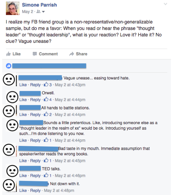
Jargon tangent: I recently did an informal survey asking friends how they felt about “thought leadership”—an expression I hear quite a bit in my professional sphere. 78 people responded. 10% felt neutral or grudgingly positive. The other 90% felt negative: They found it pretentious, confusing, or Orwellian.

People react to the phrase "Thought Leadership" with words like "Unease", "Orwellian", "Not down with it."
People react to the phrase “Thought Leadership” with words like “Unease”, “Orwellian”, “Not down with it.”

Write Well

“Writing well” is a huge undertaking —far beyond the scope of this tip sheet. The tips below are the pieces of “writing well” that are particularly applicable to writing for the Web. They can be especially helpful for people who are used to writing in a more academic or specifically-professional style (e.g., reports to a particular funder, papers for a known group of experts).

3. Find your own voice, and use it.  Within whatever style guide you might be held to, express your own ideas or build an argument from your own perspective, but in words your readers will understand. Imagine reading your piece out loud: Does it sound like you? If you read it aloud, would people listen? Readers recognize authenticity when they see it.

4. Condense your sentences.
 Check your writing with a readability tool (like this one). Keep your average sentence length down (15–20 words is a reasonable range, depending on your target audience). Vary your sentences — break up long sentences with short ones. (Write music.) Even people who have the patience to read a 40-word sentence on paper may give up after 20 words on the Web.

5. Watch the details. This includes proper grammar and punctuation. Check your spelling. Small mistakes will distract some readers from your ideas. (Imagine grit in a salad. Is the salad still good?) Also, double-check sources and quotations. It’s tempting to illustrate your point with a supporting aphorism from a famous person, or a quote from a colleague—but make sure they really said it. A misattributed or inaccurate quotation can be a big embarrassment.

Web Writing Specifics

6. Don’t paste from Word. Word is full of background formatting code that does not play well with most websites. If you wrote your piece in Word, copy and paste it into a plain-text editor (like Notepad or TextEdit) before putting it into a website content management system (CMS). Yes, you’ll have to re-do all your links—but that’s much less work than cleaning out incompatible code. If you must write in Word, and you’ll be sending your work to a content manager for publishing, it’s polite to include the URLs of any embedded links, so the content manager can reconstruct the links when s/he strips out the formatting.

7. Be conscious of length. 
This tip used to be “Keep it brief.” Experts used to recommend 300 to 700 words as a guideline for blog posts . Over the past ten years, with the rise of Twitter and mobile, very short-form writing became popular — but then there was a backlash in favor of more in-depth writing. It’s not uncommon now to see online posts of 3,000-5,000 words. If you think your piece needs to be longer, consider turning it into a series or a different type of publication. It’s a good idea to put an estimated read time at the top, and/or a summary of the key message of your post (some people call this the “TL;DR” — “too long, didn’t read”). Here’s a tool that calculates read time.

8. Make your piece scannable. Most people don’t actually read on the web. They skim through a page, looking for headings, keywords, and bullets that interest them. Would a reader still learn something from your piece if they read only the first few words, and skimmed through the highlights?

9. Make links meaningful.
 Links stand out — so make them mean something. A link to a video of a cute kid racing an otter is more meaningful and scannable than one that says to click here — even though they both go to https://www.youtube.com/watch?v=n9APqLA2YKs. (Don’t use bare URLs like that on a web page; they are not meaningful to humans, and they clutter things up.) Meaningful links are also an accessibility issue for people with disabilities. Many people with impaired vision use a “screen reader”—a device or app that literally reads website text aloud. In some modes, the screen reader only reads header and link text — it skips all the paragraph text until the user asks for a paragraph. Imagine the difference between hearing “a recent study about injectable contraceptives…today’s statement by the World Health Organization”, versus hearing “click here … here … click here.”

10. Write a good title. If someone were to try to find your piece with a search engine, what would they search for? Are those words in your title? Are they in your piece? Search engines tend to rate things more highly if the words in your title are also in your text. (Read my colleague Liz Futrell’s To Click or Not to Click: The Art of a Good Title.)

“Purple Steele Landscape” for Sara Steele’s 101 Contest

The artist Sara Steele was clearing out old copies of her desk calendars, in celebration of her 35th calendar, and decided to run a little contest, which Jeanne thought looked like fun. Jeanne and I are often looking for excuses to make art together, and I’ve admired Sara Steele’s work since my sister Michelle started using her desk calendars in the 1980s, so this was a lovely bit of serendipity.

I’m posting my collage here so I can pin it on Pinterest. (I’m not a very practiced Pinterest user, and didn’t figure out a way to upload something directly until I had already written this post.)

It’s called “Purple Steele Landscape.” I made it on Saturday (November 22, 2014) from pieces of Sara Steele’s 2005 Desk Calendar (crediting her here for use of her copyrighted work).

purple-steele-landscape-collage

The shape of the landscape–and the idea of doing a layered landscape at all–came from the undulating line of the text of the index of the calendar. This might become a diptych, as the index was in two columns. I’m also wishing that I had textured up the purple background-paper more before I started gluing–crumpled it, or painted it. Maybe it’ll grown on me. We’ll see.

Difficult times need an iron goddess

Cross-posted from my first (highly experimental) tumblr, https://www.tumblr.com/blog/wordywoady

Seems to me we’re at a fairly high angst-level, globally. The Weltschmerz is getting schmerzier, all over the Welt. This was keeping me up last night, so I started thinking about Guanyin. She is the bodhisattva of compassion, She who hears the cries of the world. Wikipedia says “Guanyin is also seen as the champion of the unfortunate, the sick, the disabled, the poor, and those in trouble.” One of her epithets is “the Iron Goddess of Mercy.” She also has her own tea. (It’s an oolong. It’s lovely.)

Seeking her image was the root of my most-magical Internet moment to date. I was looking for images of Guanyin to help me work through the psychic overload of Grand Jury duty (two to four dozen snapshots of crime, from the eye-rollingly banal to the most hideous evil, weekly for three months). I found this one.

image

Kwan Yin, Green Gulch Farm, California | Sculptura (17) | Robert V. Moody

Because this image is on the Internet, I was able to find the photographer, and ask if he would make me a print. I sent him a postal money order, and he sent me two prints and a very gracious letter.

I’m looking for the consolations in the Weltschmertz, and the jewel in the lotus. I have a beautiful artwork from a Canadian photographer (and mathematics professor), of a statue of a Chinese bodhisattva, taken at a Northern California retreat center. Not something a person would have been able to acquire until this day and age.

Knowledge Management and Beauty

A conversation I’d like to hear more of in the knowledge management and exchange (KME) [1] space is this: It is worthwhile to spend time on design of knowledge products. People will more readily absorb knowledge that is presented in a pleasing way. You aren’t going to share your knowledge effectively if looking at your newsletter makes people’s eyeballs hurt.[2] “Look and feel” isn’t about being pretty or cool; I see it as a genuine make-or-break issue for successful knowledge management.

Look and feel—which I think of as shorthand for the Venn diagram overlap of usability, user experience, and design—is important. In my experience, most people who are vocal about the importance of look and feel are designers, so I think non-designers take that opinion with a grain of salt. “Sure, *you* think it’s important to avoid flashing-spinning-screaming things and Comic Sans, but I love my ideas, and I’m the client.” (There are many excellent summaries of this client/designer tension, including The Oatmeal’s How a Web Design Goes Straight to Hell, so I’ll spend no more time on it.)

I think more people in the KM(+/-)E sphere should be concerned about look and feel—and not just about websites. Anything I produce—from an email to a print piece to a website to a conference presentation—has a look and feel. Considering look and feel, finding out what people think about it, and improving it where possible is critical to effective knowledge management and exchange.

Someone looking at a website for the first time decides in 1/20th of one second whether it looks good. That instant carries over into judgments about quality, usefulness, and reputation of a site and its content. So creating a positive first impression is a crucial first step to improving knowledge use and exchange.

If a website design makes me feel overwhelmed, I’m going to leave (that’s why I picked Google over Yahoo in the search engine wars back in the day—Google gave me a clean search box; Yahoo garbaged the search up with news and entertainment and travel options and and and…). If a brochure has jarring or out-of-context art choices (e.g., a combination of stock photography and clip art), I probably won’t read it. If a presenter is reading words from her own slides, she loses my attention. I don’t get the benefit of the attempt at knowledge exchange. In everyday life, that’s as much my fault as yours—but if you call yourself a knowledge manager, invested in knowledge exchange and uptake, it’s your responsibility to think about whether that initial 1/20th of a second will make your audience think that your website/brochure/presentation is worth more seconds, or even minutes or hours, of their attention.

[1] At some point circa 2011, I started seeing the abbreviation “KM” for “Knowledge Management” being replaced with “KME,” “KM&E”, or “KM/E”—meaning “Knowledge Management and Exchange”. The change didn’t fully take hold—”knowledge management” gets over 13,000,000 results on Google, vs. just under 6 million for “knowledge management and exchange”. I had always read the “…and exchange” as implied: To me, there’s no purpose in managing knowledge unless people use and exchange the knowledge I’m managing. Go back to reference point.

[2] I realize this whole topic marginalizes people with visual impairments. I don’t know the accessible equivalent of “look and feel”. I should probably educate myself much more on that front. Go back to reference point.

Dubious Milestone: 1,000 spam comments

I would like to thank all the marketers of Cialis, knockoff designer handbags (especially Louis Vuitton), and SEO optimization “services” for their interest in my blog. I’m touched. But since I have better things to do than moderate spam comments (for example, anything else I ever do), I have closed comments.

While I’m strongly in favor of a participatory atmosphere and an open exchange of ideas, this blog has received over 1,000 spam comments, and zero real comments. If you’re a real human who actually wants to talk to me (without me buying anything from you or accepting membership in your malware-enslaved spam-spewing botnet), you’ll find ways to contact me via the About page.


How to Write a Useful Bug Report

I work in the space between front-end web people (who write content and talk to web users) and back-end web people (who write code and build web applications). I help wonks[1] communicate with geeks[2]. A fundamental element of success in this pursuit is the Useful Bug Report. (There’s a bit of a rant coming up, so if you want to skip straight to the how-to, here’s your link.)

The tracking system we use for bugs/feature requests/etc. works well. It isn’t perfect.[3] It leaves room for gaps in wonk/geek communication. For example, the instructions for the “Description” field say:

Put as many details as possible in the Description, including links to the pages involved, usernames/emails, and your browser version.

These instructions aren’t very helpful to a wonk who is trying to write a report that will be useful to a geek. Minute detail does not necessarily produce good bug reports. On the other hand, neither does an “I was on our website and something is broken—I clicked something, and it looked weird” approach.

I just finished writing up a more practical “How To” sheet for the wonk side of my team. I would have thought this kind of information would already be widely available, but a quick Google search for “how to write a good bug report”  led me to:

  • Specific bug reporting systems which require you to log in before giving you any information (boo), and
  • Some “how to write clear bug reports” tips from bloggers who don’t write clearly (by my standards) and/or are condescending.

Not terribly helpful. I shall now rush in to fill this information gap.

~~~

How To Write a Useful Bug Report

The way you describe a bug to developers can make a big difference to how quickly they can resolve an issue. The better the bug report, the less initial troubleshooting/diagnosis the developers need to go through.

Your “Description” field [in our internal system] should contain a little narrative that includes the answers to the following:

1. Where were you? (Website / product or application / URL / section of page)

2. Were you logged in, and if so, with what permission levels? (e.g., not logged in, logged in as user or admin)

3. What operating system and browser were you running? Include version numbers if you can (e.g., Windows XP 2002 SP 3 + Firefox 10.2.0). It can be illuminating to check a bug in multiple operating systems and browsers, and then add something like this to your description: “First encountered this on my work desktop setup, where I’m running Firefox 10.2.0 over Windows XP 2002 Service Pack 3. Tested in Chrome 17.0.963.56 m and Internet Explorer 8.0.6001.18702; same results. I also tested it from home where I’m running a (really old) Mac, OS 10.5, and Firefox 9ish; same results, only slower.”

4. Describe the bug:
a. What did you click, or what action did you take right before the bug made itself known (e.g., added something new to cart, clicked “Submit”)?
b. What did you expect to happen when you took that action?
c. What actually happened?
d. What does “fixed” look like? That is, do you want the fix to reflect the “what did you expect” state above, or something else—like hiding the broken thing, or reverting to an earlier build?

This should give [our in-house development team] enough to go on to make a good start at diagnosing the issue, and save a bunch of back-and-forth emails or ticket comments.

~~~

Remember, dear reader: The above is a basic cheat sheet I wrote for my own team. Your mileage may vary. Other things like bandwidth/connection type, other programs you were running (like adblockers or portals like Blackboard), whether you were streaming Pandora at the time, etc. can also be helpful diagnostics. This isn’t the One True Way. It’s my way, today.

[1] Wonk: I use this term to mean “Expert; having a deep and detailed understanding of a particular content area which is little known by the general public.” Etymological sources differ; some suggest it is drawn from “know” spelled backwards, as in “to know your material backwards and forwards.” Go back to reference point

[2] Geek: I use this term to mean “A person who is proficient in digital technologies; who knows how to write at least one type of computer code and/or is comfortable installing, troubleshooting, or repairing computer and networking hardware.” As a person who identifies as a wonk and a geek (as well as a nerd and occasionally a dork), I use these terms with love and respect. Go back to reference point

[3] None of the bug/feature tracking systems I have used are perfect. They all have quirks, or leave something out that you wish they put in, or have more features than you’ll ever use. Go back to reference point

I have a huge crush on MailChimp

On Wednesday, I found myself in need of sage advice to help manage expectations and soothe frustrations with the process of switching bulk email providers. I spent a couple hours late on Wednesday night noodling around on the MailChimp site and thinking about how much I love them, and then thinking that the Top Ten Totally Sweet Things About MailChimp (Today) would make a cheerful and possibly useful post.

First, a little back-story: Almost everything I know about bulk email best practices I learned from MailChimp. Circa 2002, I needed to convince my executive director to get permission from people before sending them bulk email, and to update our list once in a while. I was new, and green, and practically not a geek at all [1]. My advice did not sway her. MailChimp’s materials did. Continue reading I have a huge crush on MailChimp

Google mystery, continued

Well, that was short-lived. Whatever the algorithm change was that bumped this site up (or LinkedIn, Facebook, and Google+ down), it has apparently reverted to what it was before. Again, the whale blows bubbles, and I am a perplexed bystander.