“Purple Steele Landscape” for Sara Steele’s 101 Contest

The artist Sara Steele was clearing out old copies of her desk calendars, in celebration of her 35th calendar, and decided to run a little contest, which Jeanne thought looked like fun. Jeanne and I are often looking for excuses to make art together, and I’ve admired Sara Steele’s work since my sister Michelle started using her desk calendars in the 1980s, so this was a lovely bit of serendipity.

I’m posting my collage here so I can pin it on Pinterest. (I’m not a very practiced Pinterest user, and didn’t figure out a way to upload something directly until I had already written this post.)

It’s called “Purple Steele Landscape.” I made it on Saturday (November 22, 2014) from pieces of Sara Steele’s 2005 Desk Calendar (crediting her here for use of her copyrighted work).

purple-steele-landscape-collage

The shape of the landscape–and the idea of doing a layered landscape at all–came from the undulating line of the text of the index of the calendar. This might become a diptych, as the index was in two columns. I’m also wishing that I had textured up the purple background-paper more before I started gluing–crumpled it, or painted it. Maybe it’ll grown on me. We’ll see.

Life and Death Knowledge Management: Addresses and Ebola

I just read an article about why Ebola containment has been so difficult. It’s a complex problem, certainly. There is misinformation to be overcome. There are funeral practices to be accounted for. There is equipment and training to be deployed, community health workers to teach, public health measures to be taken, an already-fragile health system to be shored up. And there is fear. But there is also something so fundamental to my professional life that it makes me weep.

In 1997, I was working at a small law firm. The three partners had a thriving practice in telecommunications law. They also had a labyrinth of a contact management system. If a client with multiple broadcast licenses (e.g., an AM license, an FM license, and a low-power FM license) moved or changed telephone numbers, we beleaguered paralegals had to update that address in at least eight and as many as eleven different places—client lists, licensee lists, accounting lists, partners’ Rolodexes.

Eleven different places. Guess what? Mistakes were made. I made one. Someone didn’t get a letter they should have. I got yelled at. I yelled back, “You know what would help? Being able to update an address once, and then be able to find it no matter what list we were looking at, the AM licensee list or the accounts receivable list or the holiday party list. It’s crazy that we have to update these things in so many places. We need a database.”

Building that contacts database was one of my formative knowledge management experiences. It turned some three-day tasks into three-hour tasks. It made our work faster and better and easier. It was life-changing, in some ways, but it was never a matter of life and death.

Almost fifteen years later I came to work on the Knowledge for Health (K4Health) Project at the Johns Hopkins Center for Communication Programs. Splashed across the program’s website, its brochures, its presentation slides, were the words “Knowledge Saves Lives.” I believe that. I took on the project’s mission as my own, and I have served it to the best of my ability.

Today those words mean something different. “Knowledge Saves Lives.” According to the article, a major reason Ebola has been so hard to contain in West Africa is this: The contacts databases are not reliable.

The process that’s helped stop diseases like SARS and smallpox seems simple: Find everyone who had close contact with infected individuals and track them for 21 days. If any of these contacts comes down with the disease, isolate them from the community and repeat the process by tracking the contacts’ contacts. But tracing works only if you have a list of the contacts and their addresses…Many contacts’ addresses were missing or were vague like ‘down by the farm road.’ In all, only 20% to 30% of the contacts in the database had a usable address.

I have a new way to explain how knowledge management can, in and of itself, be a public health intervention. But I am filled with sorrow that the most basic information and communication technologies—not even high-speed Internet, not even touch-screen miracles, just “how to have an address”—have not gone far enough, fast enough to stop this monster.

For want of a nail.

Sassi Clarifies Stock

I’ve seen a variety of instructions for clarifying stock with egg whites. The lack of authoritative step-by-step details annoys me. (I realized too late that I should have called this post “Sassi Clarifies Clarifying Stock”, but now I don’t want to mess with the permalink.) Today I had two different stocks to clarify, so I tried two different techniques. Sadly, I’m lacking important photo documentation; my phone ran out of charge at an inopportune moment, and I couldn’t wait, so I’ll have to provide visuals in a future test. Continue reading Sassi Clarifies Stock

Nine: A Song of the Varian Disaster

My telling of the battle of the Teutoburg Forest, in the year 9 CE. This song was commissioned by Sigismund of the Basternae at the Potomac Celtic Festival in June 1999, and first sung at Pennsic XXVIII in August 1999. I’m not opposed to other people singing this in non-commercial contexts, with proper attribution (to Etaíne na Preachain, if you’re singing at a reenactment event). I don’t have a recording to offer, but I’m thinking about it. EDIT (Aug. 12, 2015): Wait, I do have a recording! Video by Tim Morin (thank you!!), taken at Tir Thalor’s open camp at Pennsic 44, Sunday, Aug. 1, 2015. The lighting is a little crazy (campfire + torch + moon + light bouncing off a helmet…) but the sound and atmosphere are right on.

I wake from vivid dream, my heart all a-drum.
I stood among black trees, hung with garlands bright,
Livid in the gloom of a forest deep:
Chalk-white blooms, crimson-streaked. Continue reading Nine: A Song of the Varian Disaster

Lamb & Pumpkin Stew; Toasted Pumpkin Seeds

(Re-posted here, Sept. 2014. Originally posted on Oct. 18, 2012, as a Facebook Note.)

Here’s how I made the stew I posted a picture of yesterday (Oct. 17, 2012), plus bonus toasted pumpkin seeds. IMG_0005

[Retrospective comment: Alas, I took no photo of the Best Pumpkin Seeds Ever.]

Things you should be aware of: I have access to crazy ingredients. My mom hunts wild mushrooms. She cans or dries a lot of them and gives them as gifts. I live in a metropolitan area with specialty food shops like Balducci’s and Penzeys (where I get Aleppo pepper and most of my other spices). For the past three or four years I have put “fancy salt” on my wishlist for Christmas, so I have a collection of salts. I realize this is not normal.

Also, my almost-former-boss and longtime friend and ally Piers (whose imminent departure for a new job in France is the primary cause of both my recent sleeplessness and willingness to focus obsessively on a recipe that takes four days) said he thought it would be funny if I included not just the recipe, but also all the other stuff that was going on. Jim Chokey, I charge you with turning this narrative into recipe-file-appropriate form. Continue reading Lamb & Pumpkin Stew; Toasted Pumpkin Seeds

Difficult times need an iron goddess

Cross-posted from my first (highly experimental) tumblr, https://www.tumblr.com/blog/wordywoady

Seems to me we’re at a fairly high angst-level, globally. The Weltschmerz is getting schmerzier, all over the Welt. This was keeping me up last night, so I started thinking about Guanyin. She is the bodhisattva of compassion, She who hears the cries of the world. Wikipedia says “Guanyin is also seen as the champion of the unfortunate, the sick, the disabled, the poor, and those in trouble.” One of her epithets is “the Iron Goddess of Mercy.” She also has her own tea. (It’s an oolong. It’s lovely.)

Seeking her image was the root of my most-magical Internet moment to date. I was looking for images of Guanyin to help me work through the psychic overload of Grand Jury duty (two to four dozen snapshots of crime, from the eye-rollingly banal to the most hideous evil, weekly for three months). I found this one.

image

Kwan Yin, Green Gulch Farm, California | Sculptura (17) | Robert V. Moody

Because this image is on the Internet, I was able to find the photographer, and ask if he would make me a print. I sent him a postal money order, and he sent me two prints and a very gracious letter.

I’m looking for the consolations in the Weltschmertz, and the jewel in the lotus. I have a beautiful artwork from a Canadian photographer (and mathematics professor), of a statue of a Chinese bodhisattva, taken at a Northern California retreat center. Not something a person would have been able to acquire until this day and age.

Sassi Saucier’s Maybe-Masterpiece

For some time I’ve been posting cooking notes on Facebook (including a slightly earlier draft of this one). Henceforth, I’ll be posting them here, under the “Sassi Saucier” category. 

TL;DR: Duck confit with jicama fries and a rhubarb jus; Szechuan peppercorn duck breast with rhubarb-jicama slaw. Skip to the recipes.

If there were an Epicurean Guild I were trying to get into, this might be my masterwork submission. I do not say that lightly. It’s spectacular. I’m not even going to “IMHO” that. (That Sassi, she is not humble.) From my researches during the 2014 Rhubarb Season, I present:

Silk Road Duck Confit with Jicama Fries, and Szechuan Peppercorn Duck Breast with Rhubarb-Jicama Slaw.

Duck, Rhubarb, Jicama: Two Ways.

Servings: 4-12.

  • The confit-and-fries could serve 4 on its own if you made twice as many fries as I made for Two Ways, and had a salad.
  • The slaw is enough for 4 duck breast fillets. I only made two fillets during the Two Ways prep. (So, if you were only making one Way, you should use 4 duck breast fillets for 4 entree servings.)
  • The pairing could probably serve 8-12 as an appetizer or small plate.

Continue reading Sassi Saucier’s Maybe-Masterpiece

Decoded

box-on-table

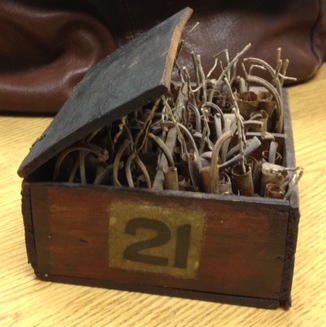
I have a small mysterious wooden box.

It was a gift from a friend, and an empty house, and a departed soul. At this writing, in January 2014, I have had it for just over a year. It is old, with tiny hinges and half a lid (broken edge, worn splinter-free) and the number “21” on two of its sides.

Inside are four compartments, each carefully filled with carefully-rolled dry leaves. I can’t tell what kind of leaves they are. Something sturdy, like red oak.

There is writing on the inside of the lid: pale pencil marks I could never read before, or only almost-read. Something about the light, or my eyes, or the box’s wishes changed tonight, and I can read it. I know it much better now.

It was a typesetter’s box. box-open

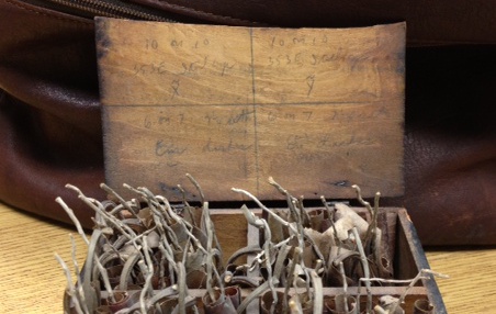
Two compartments, before they held leaves, held dashes (which before tonight might have said “disks” or “darker” or “dishes”)—em dashes and en dashes, the E’s written in loops like backwards 3’s, which contrast sharply with the straight-line E’s above them (a different hand? a different mood?).

Dashes are charming to me, with their elegant herding abilities. I use them carefully and often, and won’t write a double hyphen when I should write an em dash.

The other two compartments held Italic capital X-tildes (X̃) and Y-tildes (Ỹ), which I have never had call to use but which apparently stand for an old statistical mean and a new one.

There are other numbers that are code to me. “10 on 10”, which might be “10 or 10” and on first reading said “IomiD”. “Ital cap” is clear now, when before it could have been “Stele crp” or “Stackage”.

The box felt relieved when it was given to me. It relaxed into my hands, after others had looked at it and shaken their heads and left it on its shelf. But it kept its history to itself, letting me love it on its present merits. I love it even more now, knowing a bit more of its past, imagining it is the twenty-first in a series of boxes that used to sit companionably together on a fitted shelf, or in a cabinet, ready to work, to spell, to indicate pauses and spans, and old things and new ones.

cabinet-of-curiosities

It misses its companions, but it sits among other small mysterious beloved things, and I think it is happy.

Here are all the characters:

10 on 10 | 353E Ital cap X̃
10 on 10 | 353E Ital cap Ỹ
6 on 7 7¼ set | Em dashes
6 on 7 7¼ set | En dashes

Grit in the Dish

As a detail-oriented writer, webmaster, and knowledge worker, I notice errors. When I point them out, sometimes people are grateful. Other times, I get pushback along the lines of “Nobody cares about stuff like that except you,” or “I don’t see why you’re worried about that detail.”

Have you ever eaten steamed mussels with sand in them, or salad with grit on it? The food might be perfectly cooked, creatively seasoned, and beautifully plated. But as soon as there’s grit on your palate, you notice. If there’s one piece of grit, some people might overlook it. The more grit, the less edible the dish—no matter how good everything else is, that grit makes the dish less enjoyable, or even inedible. If you go to a restaurant twice, and there is grit in your food both times, would you go back a third time? I wouldn’t. I would think their prep work was sloppy, and that would make me worry about their hygiene practices and respect for product.

“Nobody cares except you” is a coward’s defense, and it dismisses the experience of at least part of your audience. Some people will notice the details. For example, I’m passionate about words, grammar, and usage. I notice when people use a word or phrase imprecisely or inappropriately. I notice if someone is using serial commas, or not using them, or using them inconsistently. I’m passionate, though not expert, about design; I have a strong aesthetic, and I notice when people haven’t learned the same design basics as I have—when they break a grid, or choose colors or fonts haphazardly, or don’t have real people use a product before release.

Caring about these things has earned me some ridicule, but it also has made me a valuable team member—I’ll notice the things that others on the team don’t, so when we put a product out in the world people will notice the content or usefulness of what we made, and (I hope) not be distracted by awkward design choices or grammatical errors. If we don’t pay attention to those kinds of details, some people will think less of us—and think less of our expertise.

Typos, grammatical errors, awkward usage, and inelegant or untested design are the grit in any work. Having a grit-detector on your team makes the work better, and builds your audience’s faith and trust in your expertise.

On the other hand, if the salad with grit in it is made of tough or spoiled greens, that’s a different kind of problem. Don’t bother removing the grit if the greens themselves aren’t good. Spend your energy on starting fresh.

Knowledge Management and Beauty

A conversation I’d like to hear more of in the knowledge management and exchange (KME) [1] space is this: It is worthwhile to spend time on design of knowledge products. People will more readily absorb knowledge that is presented in a pleasing way. You aren’t going to share your knowledge effectively if looking at your newsletter makes people’s eyeballs hurt.[2] “Look and feel” isn’t about being pretty or cool; I see it as a genuine make-or-break issue for successful knowledge management.

Look and feel—which I think of as shorthand for the Venn diagram overlap of usability, user experience, and design—is important. In my experience, most people who are vocal about the importance of look and feel are designers, so I think non-designers take that opinion with a grain of salt. “Sure, *you* think it’s important to avoid flashing-spinning-screaming things and Comic Sans, but I love my ideas, and I’m the client.” (There are many excellent summaries of this client/designer tension, including The Oatmeal’s How a Web Design Goes Straight to Hell, so I’ll spend no more time on it.)

I think more people in the KM(+/-)E sphere should be concerned about look and feel—and not just about websites. Anything I produce—from an email to a print piece to a website to a conference presentation—has a look and feel. Considering look and feel, finding out what people think about it, and improving it where possible is critical to effective knowledge management and exchange.

Someone looking at a website for the first time decides in 1/20th of one second whether it looks good. That instant carries over into judgments about quality, usefulness, and reputation of a site and its content. So creating a positive first impression is a crucial first step to improving knowledge use and exchange.

If a website design makes me feel overwhelmed, I’m going to leave (that’s why I picked Google over Yahoo in the search engine wars back in the day—Google gave me a clean search box; Yahoo garbaged the search up with news and entertainment and travel options and and and…). If a brochure has jarring or out-of-context art choices (e.g., a combination of stock photography and clip art), I probably won’t read it. If a presenter is reading words from her own slides, she loses my attention. I don’t get the benefit of the attempt at knowledge exchange. In everyday life, that’s as much my fault as yours—but if you call yourself a knowledge manager, invested in knowledge exchange and uptake, it’s your responsibility to think about whether that initial 1/20th of a second will make your audience think that your website/brochure/presentation is worth more seconds, or even minutes or hours, of their attention.

[1] At some point circa 2011, I started seeing the abbreviation “KM” for “Knowledge Management” being replaced with “KME,” “KM&E”, or “KM/E”—meaning “Knowledge Management and Exchange”. The change didn’t fully take hold—”knowledge management” gets over 13,000,000 results on Google, vs. just under 6 million for “knowledge management and exchange”. I had always read the “…and exchange” as implied: To me, there’s no purpose in managing knowledge unless people use and exchange the knowledge I’m managing. Go back to reference point.

[2] I realize this whole topic marginalizes people with visual impairments. I don’t know the accessible equivalent of “look and feel”. I should probably educate myself much more on that front. Go back to reference point.